KUGS Rebrand and Documentary
Branding, Photography, Production, Creative Directing
KUGS is a student run radio station at Western Washington University. Since 1974, KUGS has been a staple of the Bellingham community. The station prides itself on an extensive physical music library and a diverse range of student voices. Working at KUGS for 4 years gave me a unique perspective on the values and aesthetics of the station. With the opportunity to have my design’s implemented in the station, these projects incorporate the history and quirks of the station to invite listeners into the world of college radio.
Created with WWU Design BFA cohort members Camille Skiles and Natalie McNulty to give a playful insight to the station and the volunteers.
Short Documentary


Fig. 1 Hand-Drawn Type Animations

Receiving input from KUGS coworkers every step of the way, this rebrand focused on the nostalgia and whimsy of college radio. I dove into the scrapbooks and old branding of the station to create something new, but familiar.
Rebrand
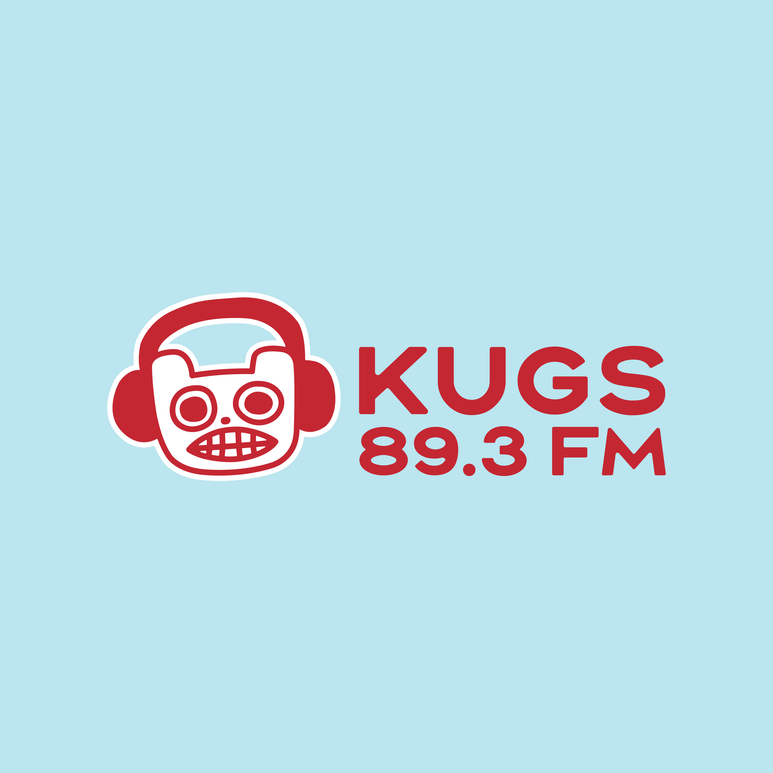

Fig. 2 New Logo Design


Fig. 3 Variable Profile Options
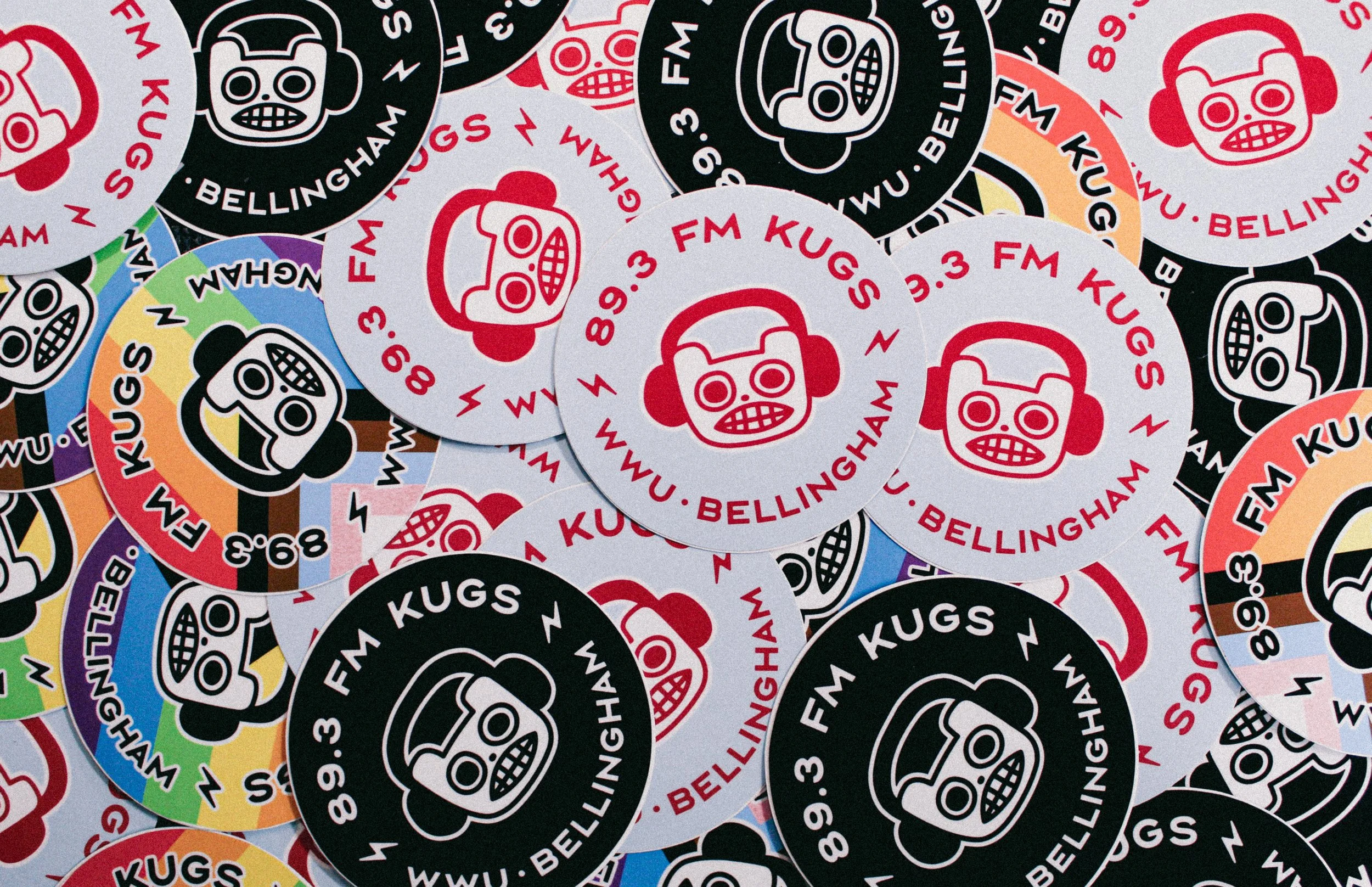
Fig. 4 Sticker Spread Photograph

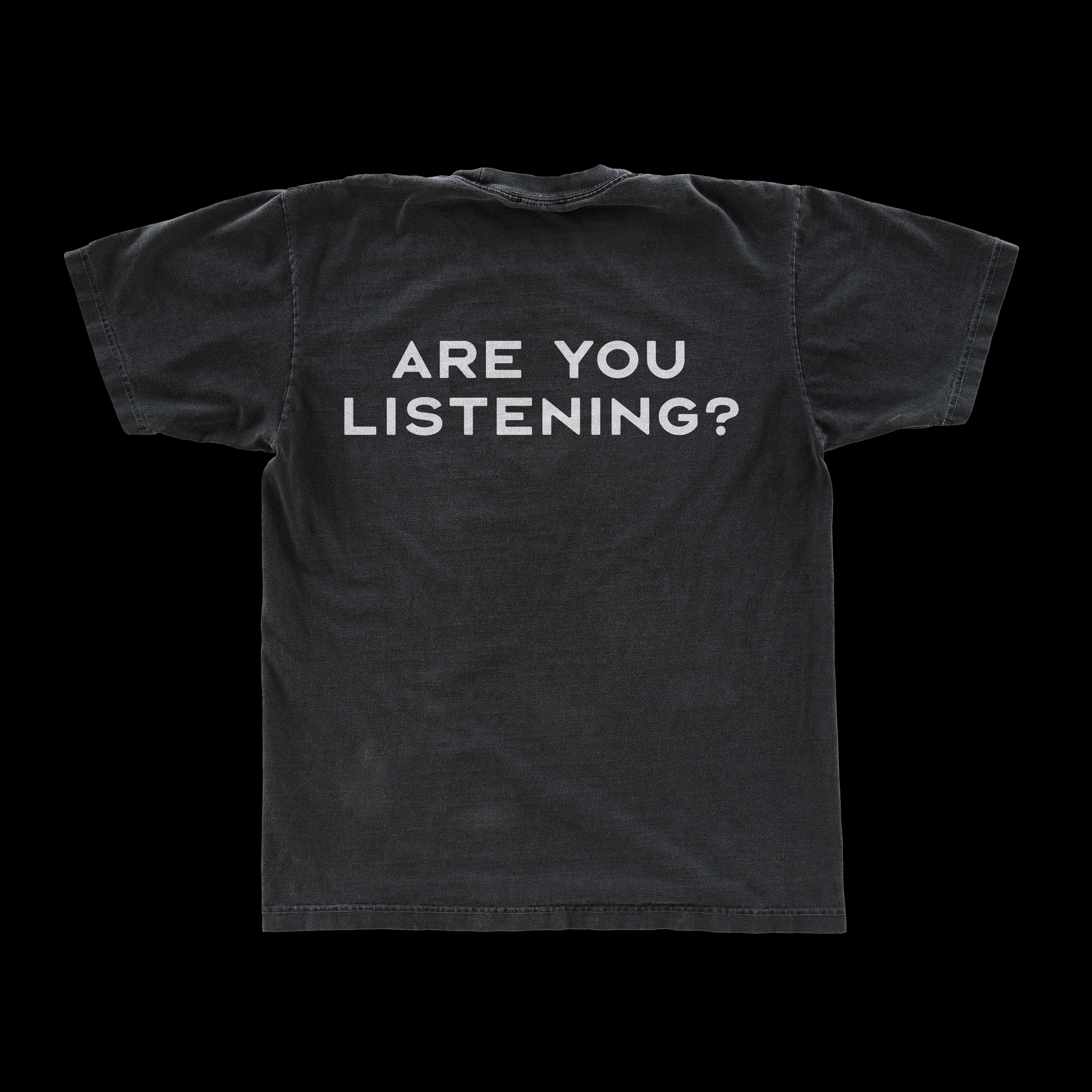
Fig. 5 Volunteer Tees Front and Back
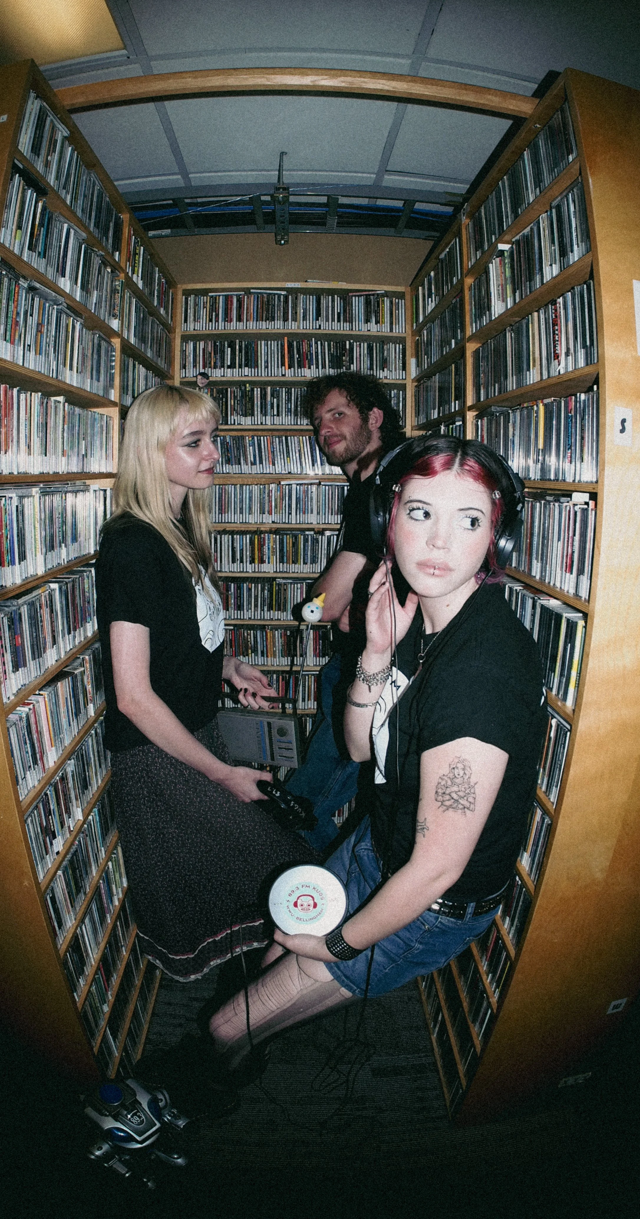
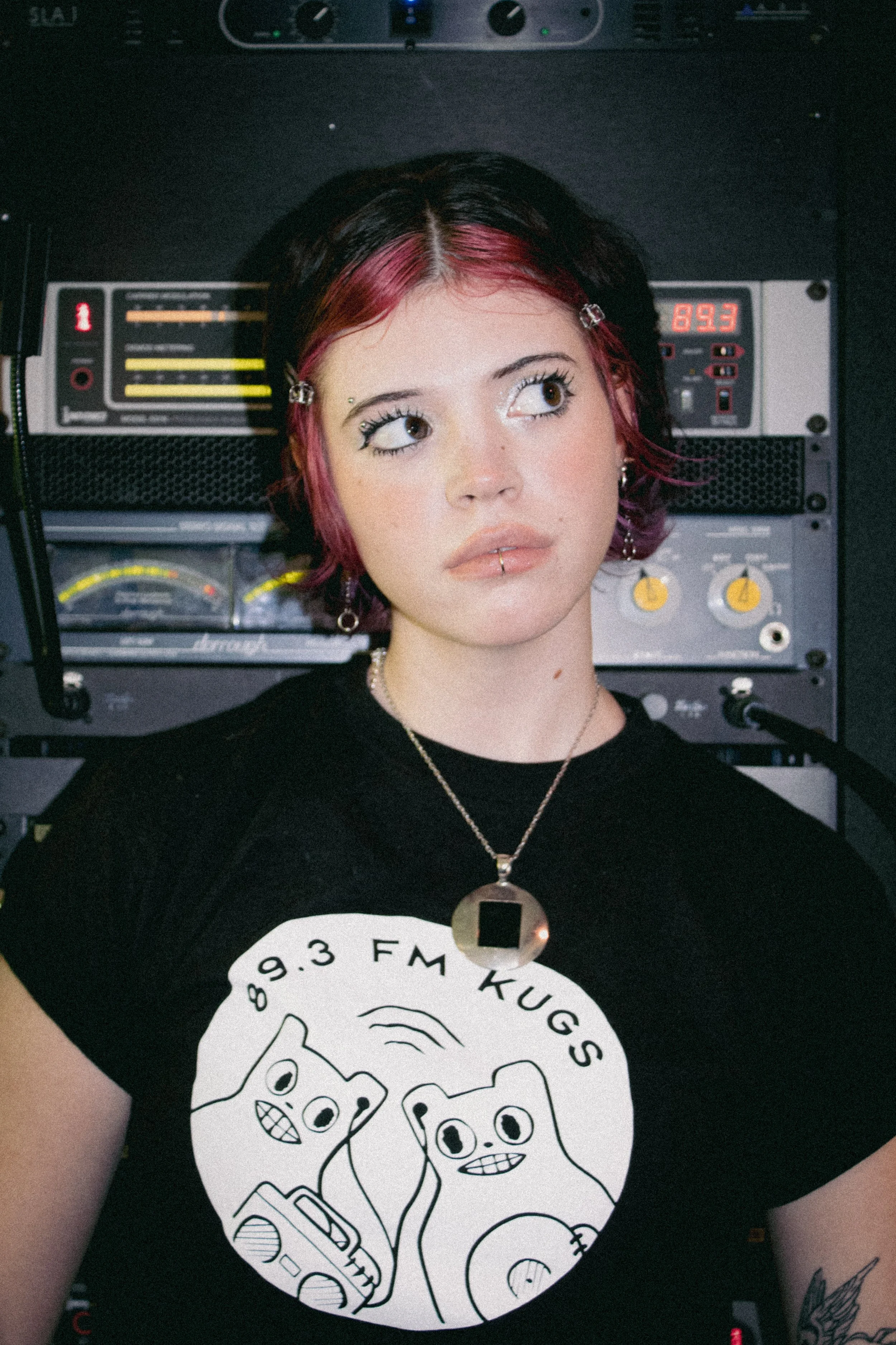
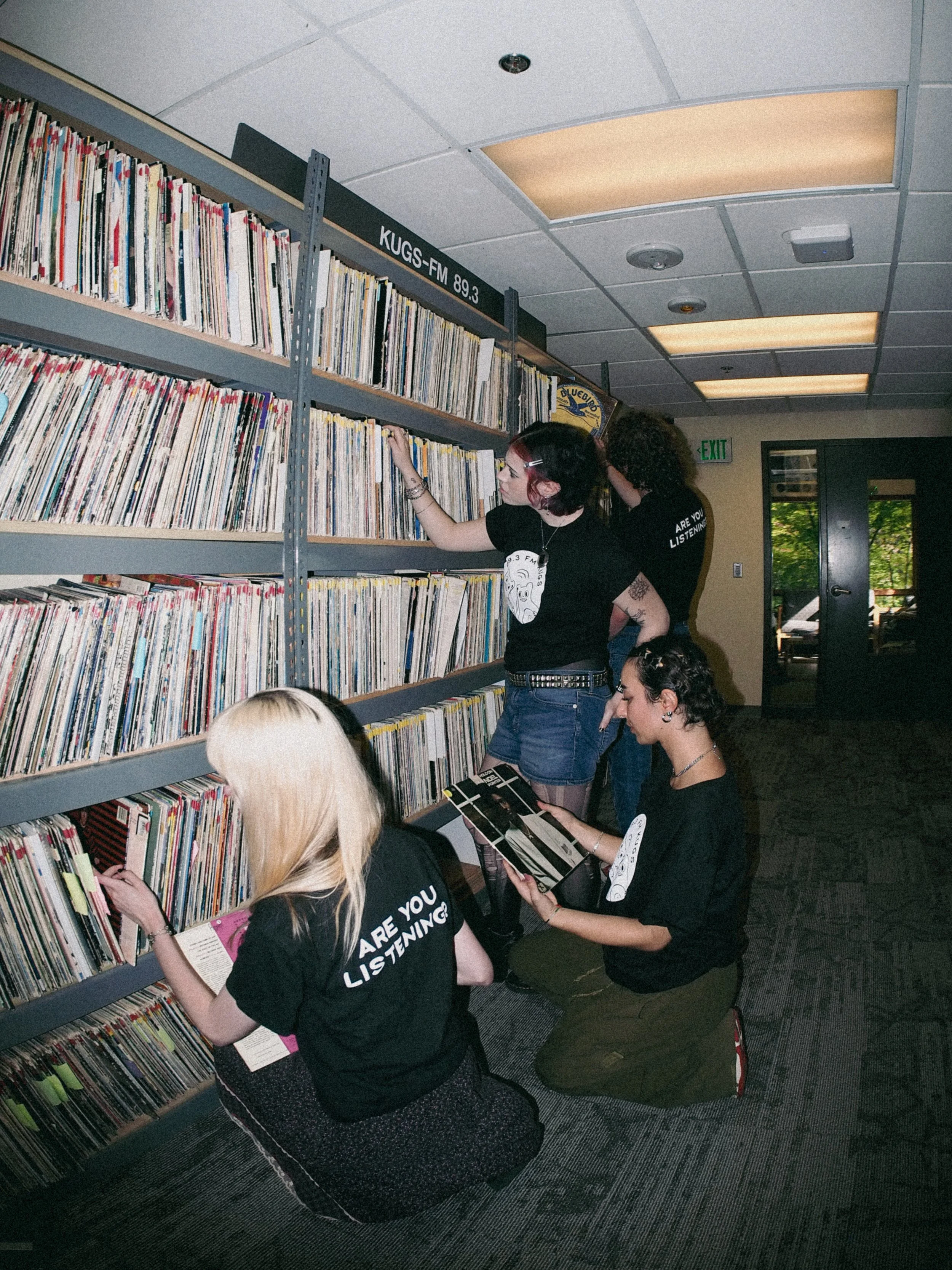
Fig. 6 Volunteers in Their Tees
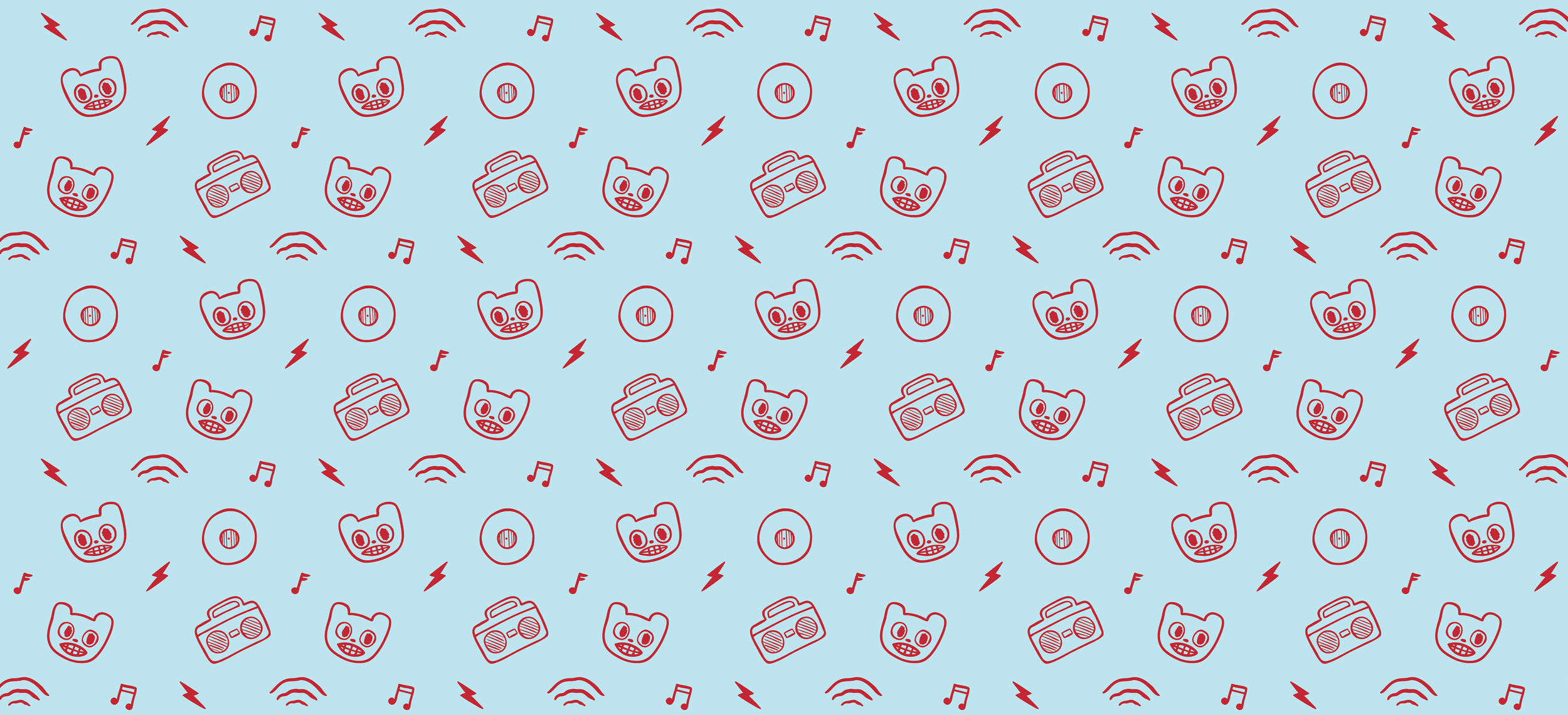

Fig. 7 Logo Animation
These projects both relied heavily on the aesthetics of the station and diving into the visual culture of the station. The process shown here illustrates how the history of the station was incorporated into the new projects and branding.
DOcumentary process

Fig. 7 Scrapbook Poster
The typography used for the title cards of the short documentary was derived from an old poster found in the scrapbooks at the station. I used a broad chisel tipped Sharpie to write each letter and their separate outlines, tracing and repeating them to be placed in a frame by frame sequence.
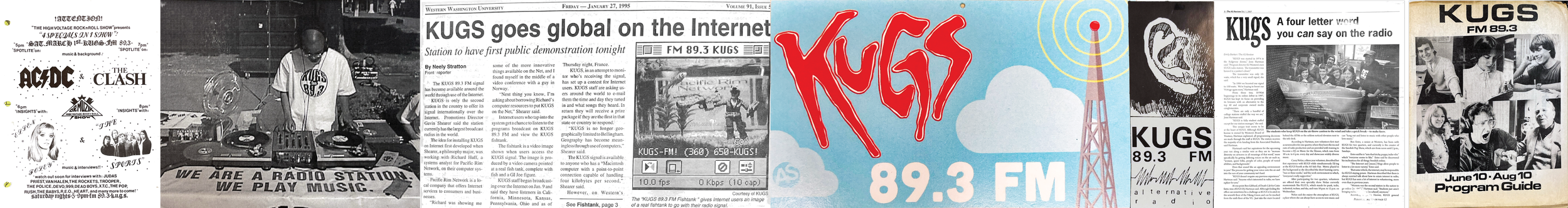
Fig. 8 Scrapbook Pulls
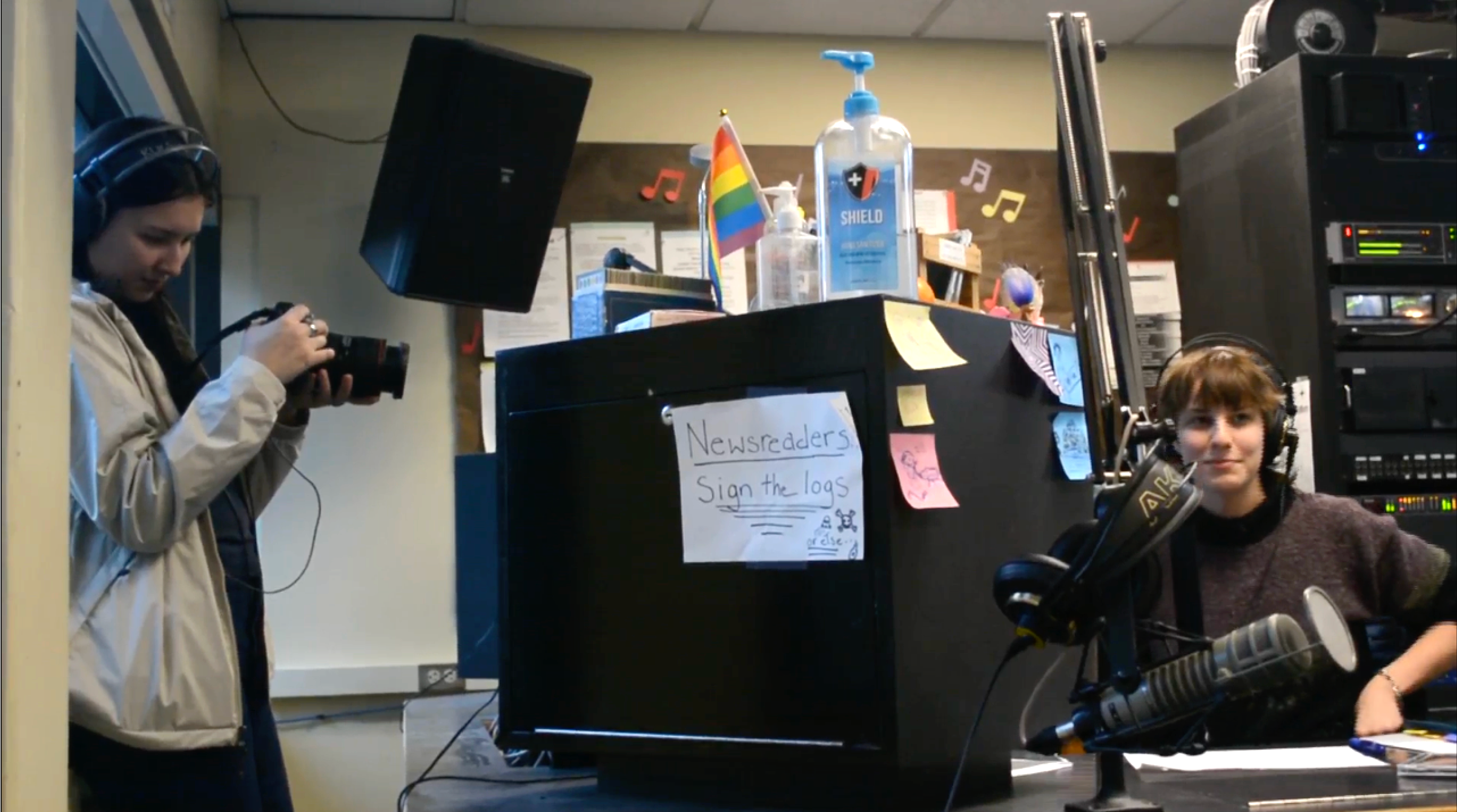

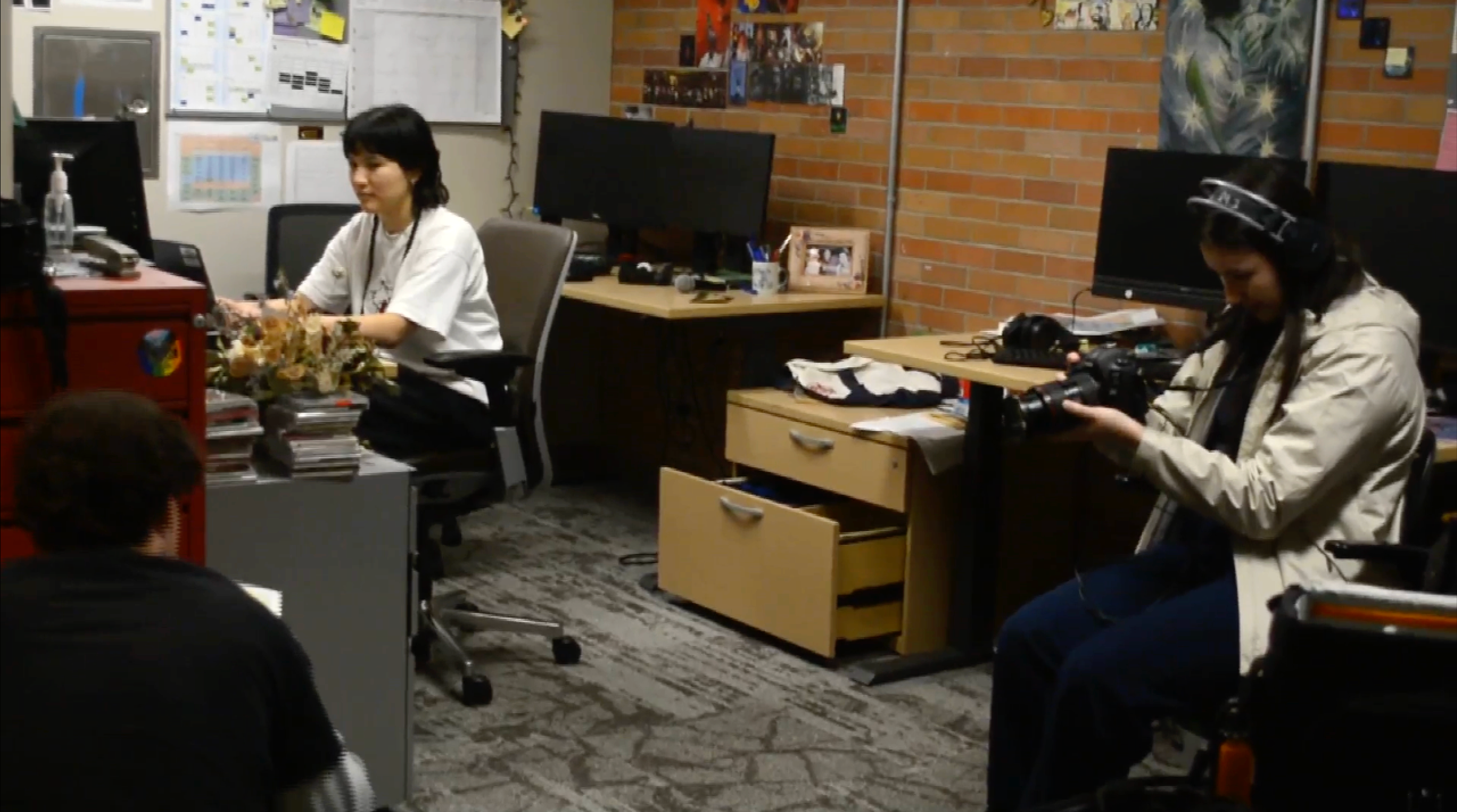
Fig. 9 BTS of Documentary Shoot
KUGS having a rich history of over 50 years contributed to the nostalgia pulled into the process of the rebrand. I asked the current staff members what aspects of the older branding they enjoyed the most in order to assess what should be carried into the new branding.
rebrand process

Fig. 10 KUGS Logos 1996-2005
The logo in usage was created in 2005 and felt out of character for the current staff and volunteers. Current KUGS staff agreed on the proposed direction of blending nostalgic elements with an updated playful logo that better fits the brand.
Fig. 11 Logo Thumbnails
Taking inspiration from the beloved bear mascot that had been adopted in previous years, the logo selected was one of my first iterations.

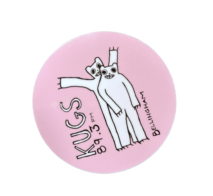


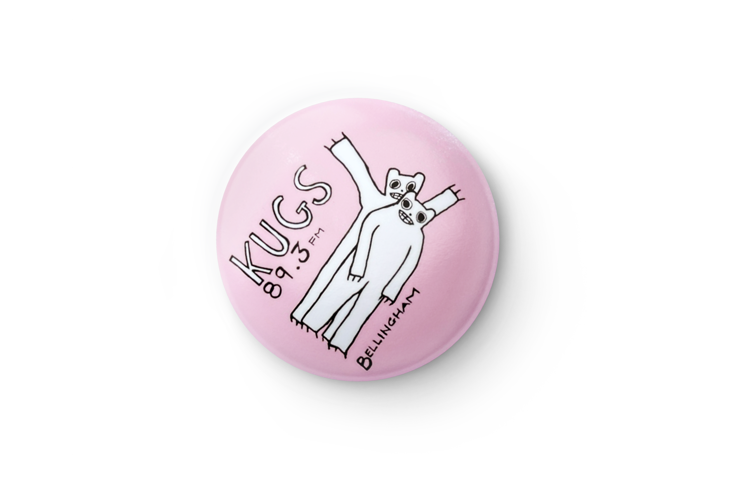
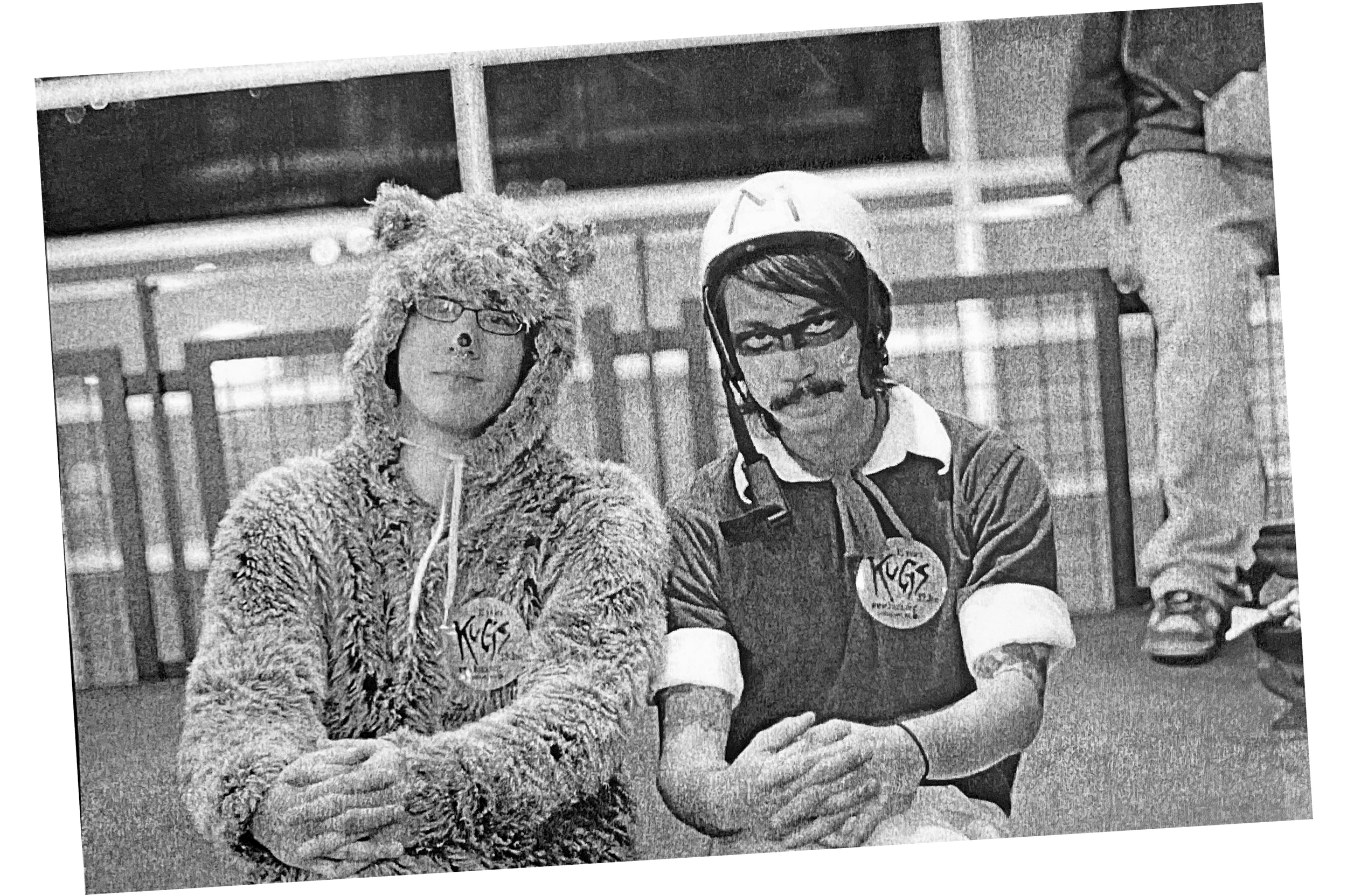
Fig. 12 Historical Documentation of KUGS Bear Mascot
Fig. 13 2023 Shirt Designed by Me and Adapted from Former Bears Imagery
After designing the previous year’s volunteer shirt design, the second bear tee shirt design felt like the next evolution of the brand.